Spark Your Imagination with 16 Stunning Bits of Liquid Design
Posted in: inspiration, blogosphere, design
There are two questions that web designers argue about a lot and even though most of the time they decide for themselves which way to go, they still have doubts about which option is the right one.
- What minimal screen resolution we should keep in mind when designing a website?
- Should we go with a Liquid (or fluid) design or a Fixed-width one?
As I said, every designer has his own opinion on these topics. I usually design with 800×600 resolution in mind, thus trying to get my main website content to be below 760px. I think that even though 1024×768 is becoming a more common screen resolution for most web users, many people still prefer to set their monitors to 800×600, or they like having several different application windows open at the same time, thus minimizing their browser window as much as possible. I often have multiple windows tiled up on my screen.
On the other hand, I do admit that it’s a bit trickier to work with liquid designs, especially because Internet Explorer doesn’t support min-width property in CSS, however I do think that many users would appreciate the flexibility of a fluid design. You should definitely read “Fixed vs Liquid vs Elastic” article written by Autistic Cuckoo. It explains both Pros and Cons for each format, but of course, in the end it’s up to you to decide which one works best for your project and your site’s target audience.
One of the common complaints I’ve heard from designers is that fluid designs don’t look as nice as the fixed-width designs. Well, take a look at these 16 websites (mainly blogs) with the liquid design, and decide for yourself.
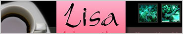
- Very beautiful weblog by designer Lisa Sabin-Wilson, who’s in the process of writing a book - Wordpress for Dummies. You can shrink down her website window to about 500px and it still looks and works well.
- Try resizing Bartelme Design’s website, and you’ll see that it is possible to have a nice fluid design even with 4 columns (in this case the first column stays fixed).

- When you resize a three-column website like How Deep is the Ocean the last two columns will drop down, keeping the main content area prominent.

- Mondern Life website has a very simple liquid design, but it has a classic feel to it.

- Dizzain.com has been featured in many CSS galleries, and for a reason - very sleek and stylish example of a fluid site.

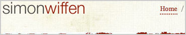
- Even part of a header is fluid on Simon Wiffen’s weblog. One of the rare sites that I was able to shrink down to almost 300px and it was still nicely viewable.
- Webrush73 has more of a hybrid design, where only the right column of the site is totally fluid. But it does make the entire site to be liquid, doesn’t it?

- ILoveJackDaniels.com has an unusual liquid style - the main centred content area can be resized down to a specific minimum and it goes up only to a certain maximum, the rest is a blank space.

- Fortress Studio site spreads on the entire browser window with a liquid main content area and a fixed right column.

- GNV&Partners is an Italian web design studio that created many pretty popular websites on the internet (check out their portfolio). Very classy look.

- Chris Williams Design features a three-column layout where each of the columns is fluid.

- The Watchmaker Project is designed with a fixed image on the left, fluid middle content area and the fixed right column, plus a flexible top navigation.

- The Man in Blue is characterized with a nice centred layout where the width can be limitlessly expanded, while constrained to a certain minimum.

- Jason Santa Maria’s website is aligned to the left but the liquid main content area fills up almost an entire browser, leaving a little bit of blank space next to the right column.

- Box of Chocolates website presents a liquid two-column layout, where both columns proportionally expand and shrink when resizing the browser window.

- When I first looked at uwMike website, I thought that it has a fixed layout, but then I noticed its fluid design that is so delicately invisible.

If you like to see more websites with a fluid design, check out the CSS Liquid Design gallery. Although I did notice that some of their featured sites are not fluid at all.
I tried to choose websites that present different layout possibilities for designing a liquid site, so hopefully they’ve inspired you to consider implementing fluid design in your own projects.
Return to: Spark Your Imagination with 16 Stunning Bits of Liquid Design
Social Web